> ## Documentation Index
> Fetch the complete documentation index at: https://makeswift-sasha-eng-8460-create-a-guide-for-troubleshooting.mintlify.site/llms.txt
> Use this file to discover all available pages before exploring further.
# Image
> Adds an Image panel in the Makeswift builder to visually edit an image prop.
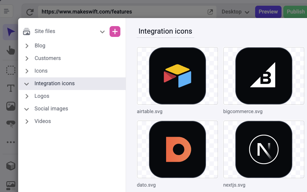
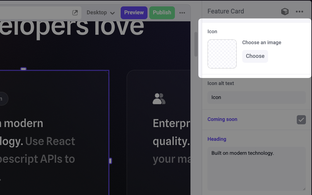 Clicking "Choose" opens the Makeswift files manager, where you can upload an image or select an existing one from your media library.
 ## Params
Text for the panel label in the Makeswift builder.
Changes the prop type this component receives. If set to `Image.Format.URL`, your component receives a `string` value of the image url. If set to `Image.Format.WithDimensions`, your component receives an object of type `ImageWithDimensions`. This format is useful when using components like [`next/image`](https://nextjs.org/docs/pages/api-reference/components/image) that require you to pass the image dimensions as props.
```ts
type ImageWithDimensions = {
url: string
dimensions: {
width: number
height: number
}
}
```
## Prop type
If `format` is set to `Image.Format.URL`, the prop type is `string`.
If `format` is set to `Image.Format.WithDimensions`, the prop type is `ImageWithDimensions`.
## Example
The following examples adds an Image control to the `icon` prop of a Feature Card component.
### Using `Image.Format.URL`
```tsx FeatureCard.makeswift.ts
import { Image } from "@makeswift/runtime/controls"
import { runtime } from "@/makeswift/runtime"
import { FeatureCard } from "./FeatureCard"
runtime.registerComponent(FeatureCard, {
type: "feature-card",
label: "Feature Card",
props: {
icon: ImageControl({
label: "icon",
format: Image.Format.URL,
}),
},
})
```
```tsx FeatureCard.tsx
interface Props {
icon?: string
}
function FeatureCard({ icon = "./default-icon.svg" }: Props) {
return (
)
}
```
### Using `Image.Format.WithDimensions`
```tsx FeatureCard.makeswift.ts
import { Image } from "@makeswift/runtime/controls"
import { runtime } from "@/lib/makeswift/runtime"
import { FeatureCard } from "./FeatureCard"
runtime.registerComponent(FeatureCard, {
type: "feature-card",
label: "FeatureCard",
props: {
icon: Image({
label: "icon",
format: Image.Format.WithDimensions,
}),
},
})
```
```tsx FeatureCard.tsx
import Image from "next/image"
interface Props {
icon?: {
url: string
dimensions: {
width: number
height: number
}
}
}
const defaultIcon = {
url: "/default-icon.png",
dimensions: {
width: 100,
height: 100,
},
}
function FeatureCard({ icon = defaultIcon }: Props) {
return (
## Params
Text for the panel label in the Makeswift builder.
Changes the prop type this component receives. If set to `Image.Format.URL`, your component receives a `string` value of the image url. If set to `Image.Format.WithDimensions`, your component receives an object of type `ImageWithDimensions`. This format is useful when using components like [`next/image`](https://nextjs.org/docs/pages/api-reference/components/image) that require you to pass the image dimensions as props.
```ts
type ImageWithDimensions = {
url: string
dimensions: {
width: number
height: number
}
}
```
## Prop type
If `format` is set to `Image.Format.URL`, the prop type is `string`.
If `format` is set to `Image.Format.WithDimensions`, the prop type is `ImageWithDimensions`.
## Example
The following examples adds an Image control to the `icon` prop of a Feature Card component.
### Using `Image.Format.URL`
```tsx FeatureCard.makeswift.ts
import { Image } from "@makeswift/runtime/controls"
import { runtime } from "@/makeswift/runtime"
import { FeatureCard } from "./FeatureCard"
runtime.registerComponent(FeatureCard, {
type: "feature-card",
label: "Feature Card",
props: {
icon: ImageControl({
label: "icon",
format: Image.Format.URL,
}),
},
})
```
```tsx FeatureCard.tsx
interface Props {
icon?: string
}
function FeatureCard({ icon = "./default-icon.svg" }: Props) {
return (
)
}
```
### Using `Image.Format.WithDimensions`
```tsx FeatureCard.makeswift.ts
import { Image } from "@makeswift/runtime/controls"
import { runtime } from "@/lib/makeswift/runtime"
import { FeatureCard } from "./FeatureCard"
runtime.registerComponent(FeatureCard, {
type: "feature-card",
label: "FeatureCard",
props: {
icon: Image({
label: "icon",
format: Image.Format.WithDimensions,
}),
},
})
```
```tsx FeatureCard.tsx
import Image from "next/image"
interface Props {
icon?: {
url: string
dimensions: {
width: number
height: number
}
}
}
const defaultIcon = {
url: "/default-icon.png",
dimensions: {
width: 100,
height: 100,
},
}
function FeatureCard({ icon = defaultIcon }: Props) {
return (
)
}
```
`.makeswift.ts` is a naming convention for organizing Makeswift registration
code. [Learn
more](/developer/reference/runtime/register-component#organizing-registration-code).